A reader (who claims to be my biggest fan) requested a box plot for the recent data on differences in meters gained. The reader wanted to more clearly see how teams vary in their performance.
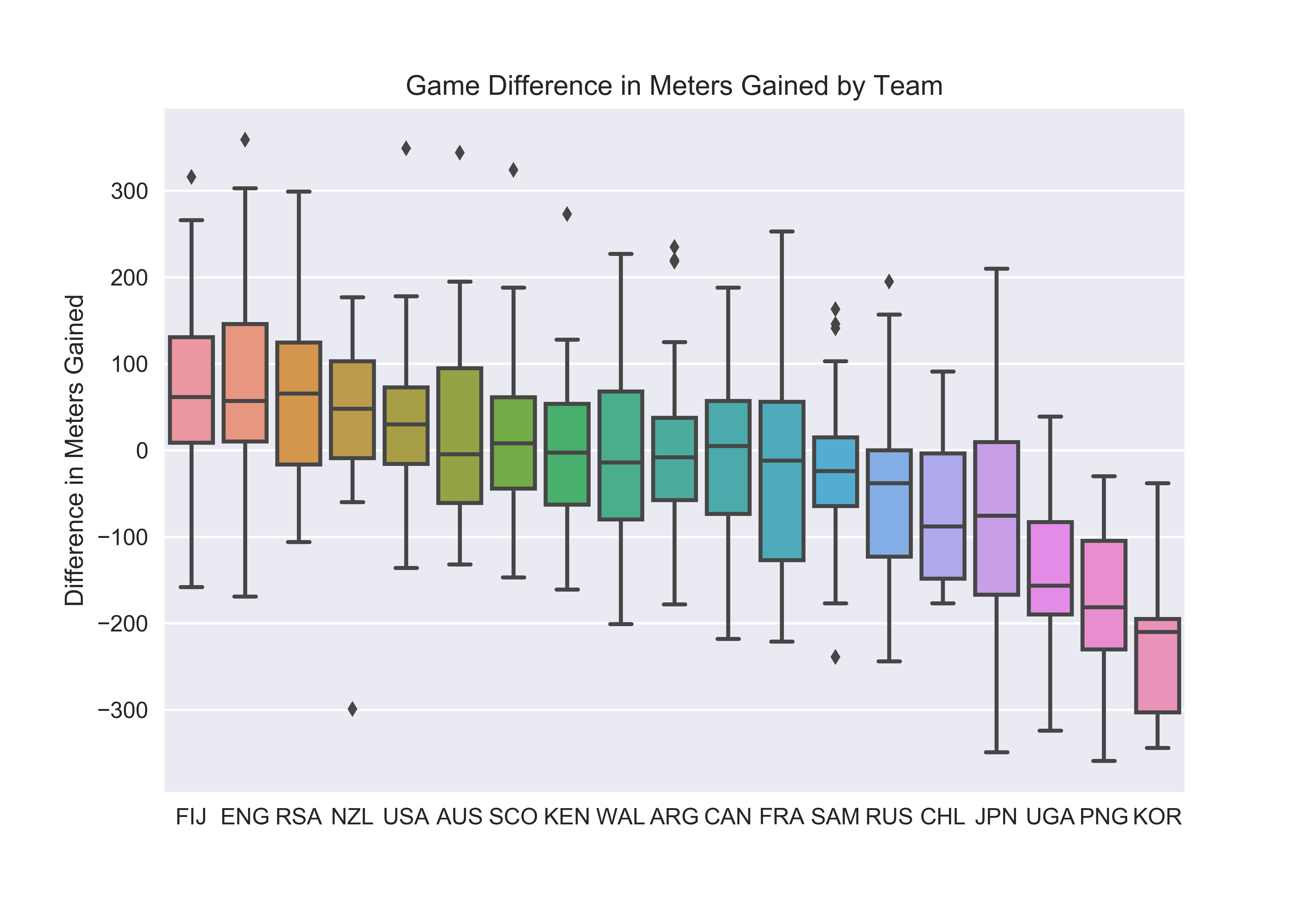
Here we see the distribution of each team’s game to game meters gained difference ordered by the team’s average difference. (Since box plots use quartiles, the bar within the box is the median, not the mean.) A taller box or set of whiskers means the team has a larger variance across games. I think we’ll all be happy to see that France varies greatly. As does England while Japan looks to have the largest spread. Conversely, New Zealand, USA, Argentina, and Samoa have some of the narrowest distributions.
I’m not too surprised by NZ considering they typically utilize a methodical offense, a strong defense, and limit the number of possession opportunities in a game. I’m more surprised by the USA who can win kickoff after kickoff versus a poor team but also had their struggles in early tournaments.
This plot may also give us our first taste of team style. Japan appear to be erratic with high risk play while NZ and Samoa appear to use a more systematic approach. Though more investigation would be needed to truly label teams.