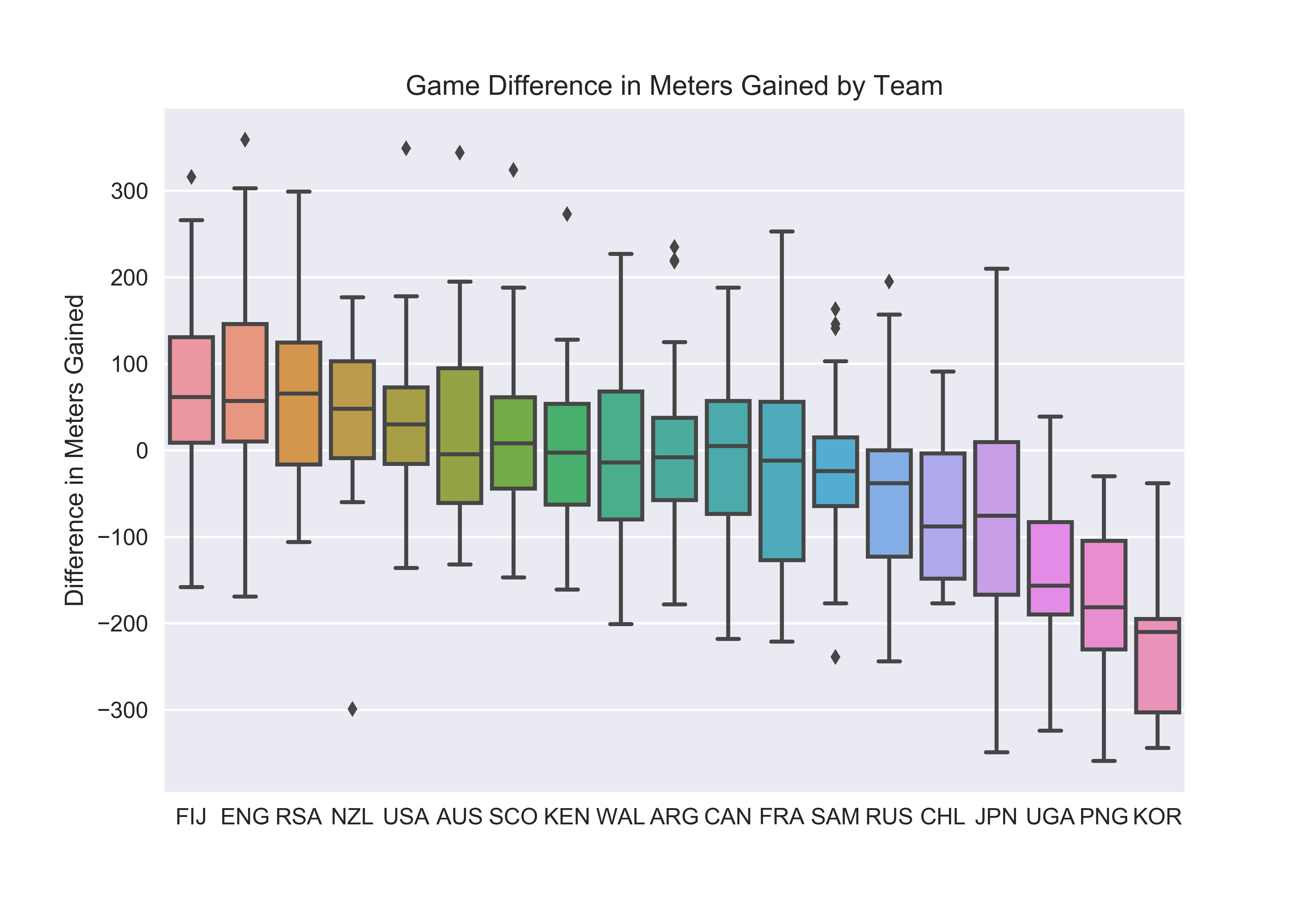
Further Visualizing Meters Gained

A reader (who claims to be my biggest fan) requested a box plot for the recent data on differences in meters gained. The reader wanted to more clearly see how teams vary in their performance.


Here we see the distribution of each team’s game to game meters gained difference ordered by the team’s average difference. (Since box plots use quartiles, the bar within the box is the median, not the mean.) A taller box or set of whiskers means the team has a larger variance across games. I think we’ll all be happy to see that France varies greatly. As does England while Japan looks to have the largest spread. Conversely, New Zealand, USA, Argentina, and Samoa have some of the narrowest distributions.

I’m not too surprised by NZ considering they typically utilize a methodical offense, a strong defense, and limit the number of possession opportunities in a game. I’m more surprised by the USA who can win kickoff after kickoff versus a poor team but also had their struggles in early tournaments.

This plot may also give us our first taste of team style. Japan appear to be erratic with high risk play while NZ and Samoa appear to use a more systematic approach. Though more investigation would be needed to truly label teams.


Meters Gained and Margin of Victory

In yesterday’s post I showed each team’s season long trends for meters gained and conceded by game. As an introduction to considering the application of meters gained, I broadly mentioned how gaining meters is good for a team. This makes sense and still holds true but to illustrate this statement I created the plot below.

The chart plots each game’s difference in final score as it relates to the game’s difference in meters gained. The relationship is clear, the more meters a team outgains their opponent by, the more points that team should win by. Outgaining your opponent doesn’t guarantee victory but the R² is .81 and nearly every team that gained more than 100 meters than their opponent has won the game.

Perhaps the concept isn’t incredibly enlightening to you. But seeing the data lets us know a few things. First, from a stat-taking perspective, it’s clear that tracking meters gained is worthwhile. Measuring meters gained from certain game situations could even help evaluate the success of set pieces, individual players, or tactical changes.

Second, the slope of the regression line, around .147, tells us what to expect from gaining meters. So for every meter a team outgains their opponent, you’d expect an additional .147 points on the scoreboard. For example, if you outgain your opponent by 100 meters, you’d expect to win by 14 to 15 points.

Knowing that expectation can guide decision making. If a team is outgaining their opponents but losing, they may be the victim of some bad luck. That bad luck could come in the form of turnovers near either tryline or some uncharacteristic missed conversions. A team could easily lose their two Sunday matches while outgaining their opponent, and without the above knowledge the coach may deem the tournament a failure and make knee-jerk changes. Whereas if they continue to play as they did, and continue to outgain their opponents, in the long run the team will be successful and win similar games in the future.

I should make it clear that “bad luck” events do matter and definitely affect the outcome of the game they occur in. But there’s a good chance these events are not as indicative of future results as other metrics, such as meters gained.

Plotting Meters Gained and Conceded

Motivation
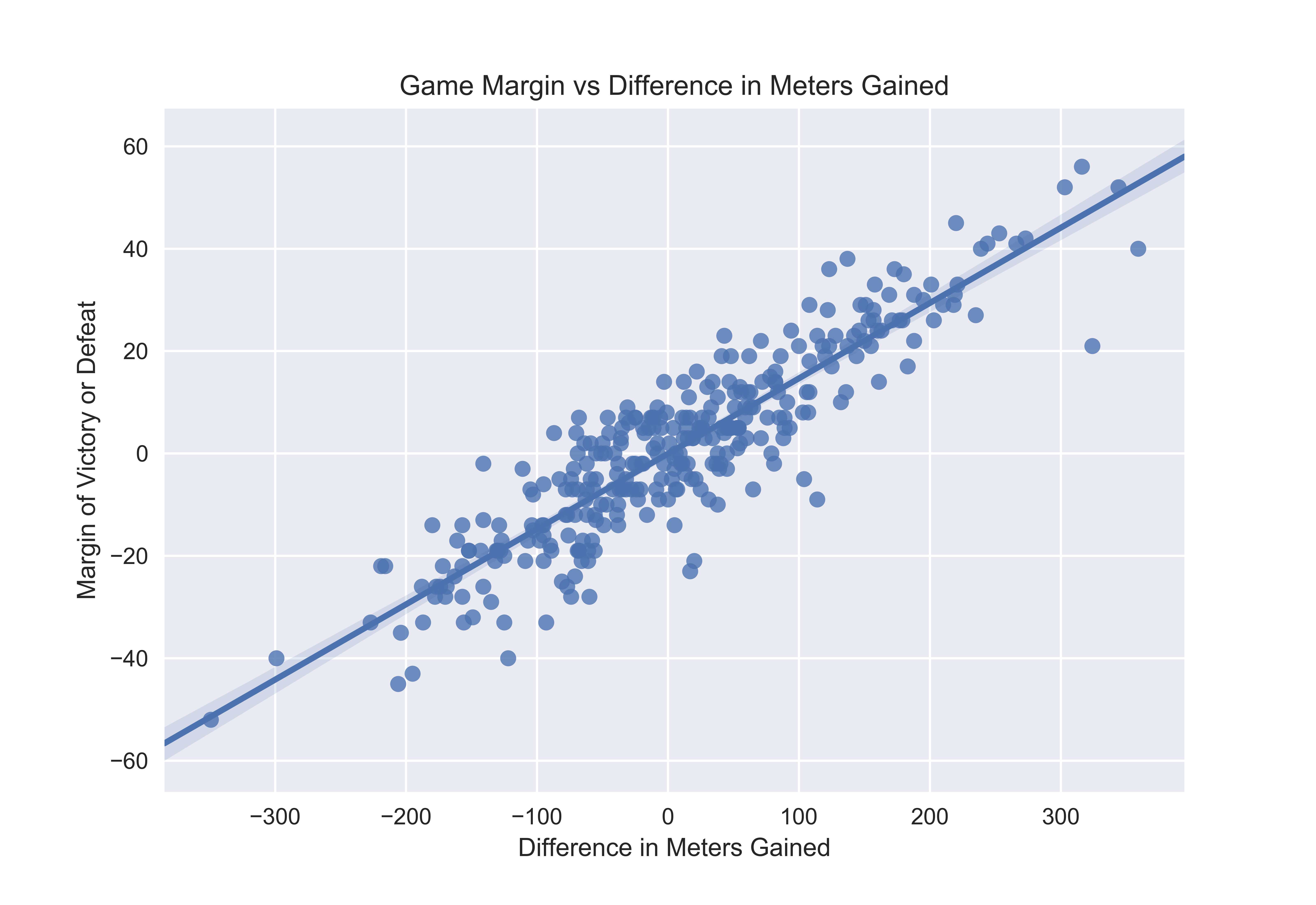
I’ve been interested in visualizing the relationship between meters gained or conceded and overall team success. My data shows that the best teams gain the most meters and concede the fewest. This makes sense even without the numbers; teams need to move the ball towards the opposition try line to score.

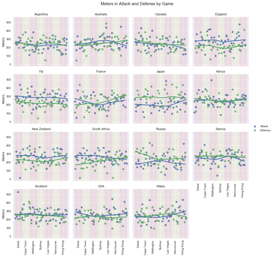
I also was interested in seeing how teams were trending in meters gained and conceded. Do these trends help illustrate personnel or tactical changes within teams? I went ahead and plotted the figure below.

Explanation
There’s a lot going on so I’ll make sure things are clear. First, I’ve created the same plot for each core team with the same scales for easy comparison between teams. I eliminated non-core teams since their low number of games created noisy and truncated graphs. The dots display meters gained (blue) and meters conceded (green) for each game played this year. The lines show the teams’ trends across the games. Games are displayed in chronological order left to right; Dubai is on your left and the most recent games in Hong Kong are on the right. The colored vertical shading represents individual tournaments.

Analysis
Take Russia for example. Their meters conceded in defense (green dots and line) were very poor in Dubai. But they improved and from Sydney on, have mostly remained the same. On the other side of the ball, in attack, they were poor in Dubai as well. But they improved, culminating in a Challenge Trophy victory in Sydney, before dropping off again.

England and Fiji have been notably consistent in their success. Both have maintained what looks to be an average 50-75 meter per game advantage over their opponents. Meanwhile, the series-leading Blitzboks were incredible to start the season, but have seen a consistent increase in meters conceded and more recently, a decline in their meters gained. Their loss of advantage in meters gained and conceded correlates with some of their worst results of the season. In their Hong Kong semi-final they needed overtime to get by the USA before suffering their worst defeat of the year, 22-0 to Fiji in the final.

Australia is another interesting case. En route to bronze in Hong Kong, they managed victories over England, Argentina, and the USA all while being out-gained in meters. Considering the wide variation in meters gained and conceded from game to game, their wins could be the result of pure luck, rather than some team tactic that involves scoring without gaining meters. I would not have seen this without the chart above and it’s something to keep an eye on in Singapore.

Summary
I think this chart has promise and I’ll likely reproduce it after future tournaments. It helps illustrate overall team success and failure through the series and provides a quick comparison between teams. Trends can be noticed quicker than with tabular data and this same display with different metrics could provide similar insight.

P.S. – Technical Mechanics
I do nearly everything in Python and the above chart was created using FacetGrid and RegPlot from the Seaborn library. My first attempt was with Seaborn’s lmplot (which is a combination of FacetGrid and RegPlot) but I was having trouble creating the colored vertical bands. Not saying it’s not possible to do it with lmplot but I solved it by building the FacetGrid myself.